Icons need text labels

I’ve spent a great deal of time recently staring at ambiguous icons trying to guess their meaning and offer suggestions, it’s a fascinating study and mind numbing at the same time.

When designing icons for interfaces it’s important to note that a user’s understanding of an icon is based on previous experience. This came up recently when evaluating an interface’s usage of the checkmark symbol as a signifier of a change of state (in this instance selecting a photo). In my experience this has always signified completion or success when working through a task or a process, but it seems Apple and Google both are using this in entirely different contexts.

In her article “Icon Usability” Aurora Bedford argues that “due to the absence of a standard usage for most icons, text labels are necessary to communicate the meaning and reduce ambiguity”. I’m not sure this is possible in every instance but it’s a valid argument.

Icon labels should be visible at all times, without any interaction from the user. For navigation icons, labels are particularly critical. Don’t rely on hover to reveal text labels: not only does it increase the interaction cost, but it also fails to translate well on touch devices.

Via: Icon Usability


Real world design is often iterative – fail fast so you can succeed sooner.

Failing fast is one of those seemingly overly simplistic tenets that I often fail at achieving. Balancing perseverance (stubbornness) and the realisation that through failure we learn or succeed is often difficult to achieve.


Persona definition

persona

From Aurora Bedford:

The field of user experience centers on the idea that we must design products around people, rather than teaching people how to use products: user-centered design (UCD), not technology-centered design. In order to do so, we must understand people—their behaviors, attitudes, needs, and goals. […]

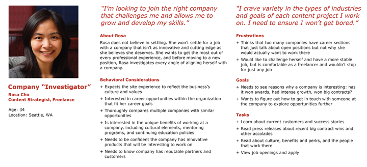
A persona is a fictional, yet realistic, description of a typical or target user of the product. A persona is an archetype instead of an actual living human, but personas should be described as if they were real people.

The description should be thorough, including details about the persona’s needs, concerns, and goals, as well as background information such as age, gender, behaviors, and occupation. This focus on a singular individual—or a small set of individuals, if using multiple personas—fosters empathy for the specific users we are designing for, and helps us break away from the attempt to design for everyone. A persona doesn’t need to document every aspect of the imaginary individual’s life, but rather should focus on those characteristics that impact what is being designed. It is likely that a business will have several personas to cover the various aspects of their organization, with one or two of them identified as the main targets for each product or service, feature set, or content area of a website.

Common pieces of information to include are:

  • Name, age, gender, and a photo
  • Tag line describing what they do in “real life”; avoid getting too witty, as doing so may taint the persona as being too fun and not a useful tool
  • Experience level in the area of your product or service
  • Context for how they would interact with your product: Through choice or required by their job? How often would they use it? Do they typically use a desktop computer to access it, or their phone or other device?
  • Goals and concerns when they perform relevant tasks: speed, accuracy, thoroughness, or any other needs that may factor into their usage
  • Quotes to sum up the persona’s attitude

Via Personas Make Users Memorable for Product Team Members


In many ways, the most creative, challenging, and under-appreciated aspect of interaction design is evaluating designs with people. The insights that you’ll get from testing designs with people can help you get new ideas, make changes, decide wisely, and fix bugs.


To design is much more than simply to assemble, to order, or even to edit; it is to add value and meaning, to illuminate, to simplify, to clarify, to modify, to dignify, to dramatize, to persuade, and perhaps even to amuse.
Paul Rand


On Engagement, Retention, and Distribution

This is a whole new category of study for me. Here are few sources that are getting me started.

Keith Schacht writes an amazing detailed how-to for analyzing your product’s customers entitled Web and Mobile Products: Understanding your customers, while defines the term viral loop and how to build your own viral loop in his article What’s your viral loop? Understanding the engine of adoption.

“Regardless of a company’s earlier success, thriving in the new mobile app economy depends on engagement and retention. After acquiring users, the real battle to keep and ultimately monetize consumers begins”, from App Engagement: The Matrix Reloaded.

“the power of the network effect is fading, at least in its current incarnation. Traditionally defined as a system where each new user on the network increases the value of the service for all others, a network effect often creates a winner-takes-all dynamic, ordaining one dominant company above the rest ..” from The Network Effect Isn’t Good Enough.

“A viral product derives much of its growth from its current users recruiting new users. A user could recruit another through a simple invitation (“Check out this product, it’s cool/useful/entertaining!”), or directly through using the product (“I want to send you money on PayPal!”)”, from How to Model Viral Growth: The Hybrid Model.


More than a century and a half before our modern malady of confusing productivity with purposefulness and the urgent with the important, Thoreau wrote in an entry from the last day of March in 1842:

The really efficient laborer will be found not to crowd his day with work, but will saunter to his task surrounded by a wide halo of ease and leisure. There will be a wide margin for relaxation to his day. He is only earnest to secure the kernels of time, and does not exaggerate the value of the husk. Why should the hen set all day? She can lay but one egg, and besides she will not have picked up materials for a new one. Those who work much do not work hard.

Via.


Detour: Location-Aware Audio Walks

Detour is a brand new way to experience the world. Gorgeous audio walks in San Francisco that reveal hidden stories, people and places all over SF. Each hour-long Detour takes you at your own pace, your own schedule, alone or synced with friends.

Lovely idea, an “immersive location-aware audio walk service”, perfect for people like me who might land in a place alone and might appreciate a guide to the more interesting places off the beaten path. Similar to something I explored before.


A redesign of the iOS notification center

Some nice ideas but in practice I doubt I would use them. People prefer to do most of their interaction within the app itself. Notifications are simply alerts and as such don’t need to be interacted with. Launching the app that sent the alert is only a swipe away, that should be efficient enough.


Arnold Lund’s Expert Ratings of Usability Maxims

I’ve been doing allot review/reading lately, visiting dog-eared old books, and looking through my Evernote bucket for tidbits of user experience wisdom. I came across this list of 34 maxims (this format was at one time particularly popular) created by Arnold Lund. I find lists like this particularly useful for mapping to past learning and experience. Created in 1997, it’s still as relevant today as it was then, and it serves as a useful reminder and a great guide for future work.

  1. Know thy user, and YOU are not thy user.
  2. Things that look the same should act the same.
  3. Everyone makes mistakes, so every mistake should be fixable.
  4. The information for the decision needs to be there when the decision is needed.
  5. Error messages should actually mean something to the user, and tell the user how to fix the problem.
  6. Every action should have a reaction.
  7. Don’t overload the user’s buffers.
  8. Consistency, consistency, consistency.
  9. Minimize the need for a mighty memory.
  10. Keep it simple.
  11. The more you do something, the easier it should be to do.
  12. The user should always know what is happening.
  13. The user should control the system. The system shouldn’t control the user. The user is the boss, and the system should show it.
  14. The idea is to empower the user, not speed up the system.
  15. Eliminate unnecessary decisions, and illuminate the rest.
  16. If I made an error, let me know about it before I get into REAL trouble.
  17. The best journey is the one with the fewest steps. Shorten the distance between the user and their goal.
  18. The user should be able to do what the user wants to do.
  19. Things that look different should act different.
  20. You should always know how to find out what to do next.
  21. Don’t let people accidentally shoot themselves.
  22. Even experts are novices at some point. Provide help.
  23. Design for regular people and the real world.
  24. Keep it neat. Keep it organized.
  25. Provide a way to bail out and start over.
  26. The fault is not in thyself, but in thy system.
  27. If it is not needed, it’s not needed.
  28. Colour is information.
  29. Everything in its place, and a place for everything.
  30. The user should be in a good mood when done.
  31. If I made an error, at least let me finish my thought before I32. have to fix it.
  32. Cute is not a good adject33. ive for systems.
  33. Let people shape the system to themselves, and paint it with their 34. own personality.
  34. To know the system is to love it.

Reference: Lund, A M (1997) “Expert Ratings of Usability Maxims.” Ergonomics in Design: The Quarterly of Human Factors Applications, Volume 5, Number 3 (July) pp. 15-20.