Good creators don’t talk shit about their fellow creators. They champion the work of those around them. They know how hard this stuff is. They accept that stumbles are part of what we do. And they treat one another with respect—because we all deserve that. Eric Karjaluoto

From Don’t Be a Crehater


A Tale of Two Cities

I prefer the number on the right.

I think Spring in Prince Edward Island has been cancelled this year and we might just slip into summer, if we are lucky. Meanwhile, it’s almost time to turn on the air conditioner in Hsinchu.

My wife laments the heat and mosquitos while running. I wonder if it’s possible to get frost bite (actually it’s too cold for me to run outside and I opt for a treadmill).


Amidst all the attention given to the sciences as to how they can lead to the cure of all diseases and daily problems of mankind, I believe that the biggest breakthrough will be the realization that the arts, which are considered “useless,” will be recognized as the whole reason why we ever try to live longer or live more prosperously. The arts are the science of enjoying life.
John Maeda


Trends in UI, Interaction, & Experience Design


Back when Nokia was publishing research I looked forward to listening to Younghee Jung’s thoughts on design. Nice to see her as a part of this video.

The 18 minute “Connecting” documentary is an exploration of the future of Interaction Design and User Experience from some of the industry’s thought leaders. As the role of software is catapulting forward, Interaction Design is seen to be not only increasing in importance dramatically, but also expected to play a leading role in shaping the coming “Internet of things.” Ultimately, when the digital and physical worlds become one, humans along with technology are potentially on the path to becoming a “super organism” capable of influencing and enabling a broad spectrum of new behaviors in the world.


Training in PEI

Judging by the number of people running throughout the time I have been home here on the Island, I’m likely in the minority in thinking that training here is an exercise in frustration. Perhaps the years I have spent overseas have weakened my ability to withstand the cold.

The weather today called for high temperatures around 15C with the ever-present cloudy skies. As I step outside the door to go for a long run it’s raining and only 4.

The locals know that weather reports are at best entertainment, something to be talked about, but certainly nothing to count on. Hence the CBC weather man.

I came here 7 weeks ago for family reasons but hoped to keep my training schedule for a race in June. Running helps me concentrate, think and maintain focus. It’s helped me physically too, but I have problems with that scrawny runner body. After running there is little time for a weight room, little energy either.

Initially instead of opting for expensive running gear, and the risks in running in the near constant snow storms this past 7 weeks, I joined a gym for a month. Running in a gym takes most of the joy out of running, so I bought a couple articles of clothing, thinking that the weather is breaking. I didn’t buy rain gear. Getting wet in Taiwan is no fun on long runs either, in China my clothes might melt.

So I sit here looking at this blog and fuming that I have to spend a couple hours on a treadmill, while being forced to watch CNN or the food network on a screen right in front of me, while listening to some ugly loud music blaring from the overhead speakers. If we move back here, an investment in a treadmill will be necessary for all but a few months a year.


An Information Architecture Process

I found this process amongst a category of old files – it dates from about 2002 when I was working with librarians to rearchitect various corporate web systems at the time. I’m sure I must have written this outline as a way to communicate next steps – we loved the waterfall process back then.
  • Take all the content and features apart (analysis)
  • Then put it all back together again (synthesis)

Analysis

  1. Create a complete listing of all content: Forget how content is produced, Political structures
  2. From the content audit, identify broad types of content
  3. Create core content attributes
    • All content is intended:
      • For someone (an audience)
      • Who is trying to do something (a task)
    • Identify intrinsic attributes of each content type
    • Start with some simple questions:
      • What is it? (White paper? Product review?)
      • Who made it? (Author)
      • When was it made? (Date Published)
      • Where was it made? (Location/Company Published)
      • What is it about?
      • What type of media?
  4. Subject Attributes
    • All content has a subject
    • Subjects exist independent of content
    • Subject attributes are highly specific to that subject
  5. Attribute Relevance
    • Prioritization based on persona(s)

Synthesis

  1. Taxonomy
    • Look for commonalities among attributes
    • Group like attributes into categories
    • Organize categories into hierarchies
  2. Primary and Secondary Structures
    • Multiple overlapping taxonomies are very common
    • Prioritize taxonomies by relevance
    • Make less relevant taxonomies secondary
  3. Final Relevance (to target) and labeling
  4. Verify with testing

Ti Chang on Manufacturing in China as an American Designer

For a lone female entrepreneur, the journey is as frustrating as it is rewarding. Running a sex toy startup as a woman automatically makes me an anomaly. Nevermind the sex toy part—just having started my own company, as a woman, is rare. Luckily, it’s not so rare that women can’t find success. According to Wealth-X, the U.S. has the highest number of self-made female billionaires, followed by China and Italy in a distant third. China’s work ethic promotes equality through earned merit, and unsurprisingly, there are many Chinese female entrepreneurs who are leading the charge.

Despite that, yes, I have met sexism and prejudice along the way—but in China, I learned that ultimately I am judged by my character, work ethic, and the business I create, so that initial judgement is only temporary. When I visit a factory for the first time, the people greeting me often ask, “When is the customer coming?” assuming that I am a translator. I smile and inform them that I am actually the customer and it is MY company. They are taken aback, but they generally get over it quickly. Ultimately, they care about making money: as long as you pay on time, they are happy to do business with you. In my years of visiting factories I never once encountered one whose owners turned me away because they were uncomfortable dealing with a woman. They have turned me away for legitimate reasons—as volume, a mismatch between my products and the factory capability, or an inability to meet my quality assurance standards—but not because of my sex.
Ti Chang

A sex toy start-up is not an idea that I have seriously considered.


Inside look at NetDragon

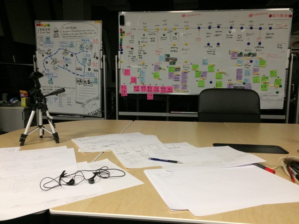
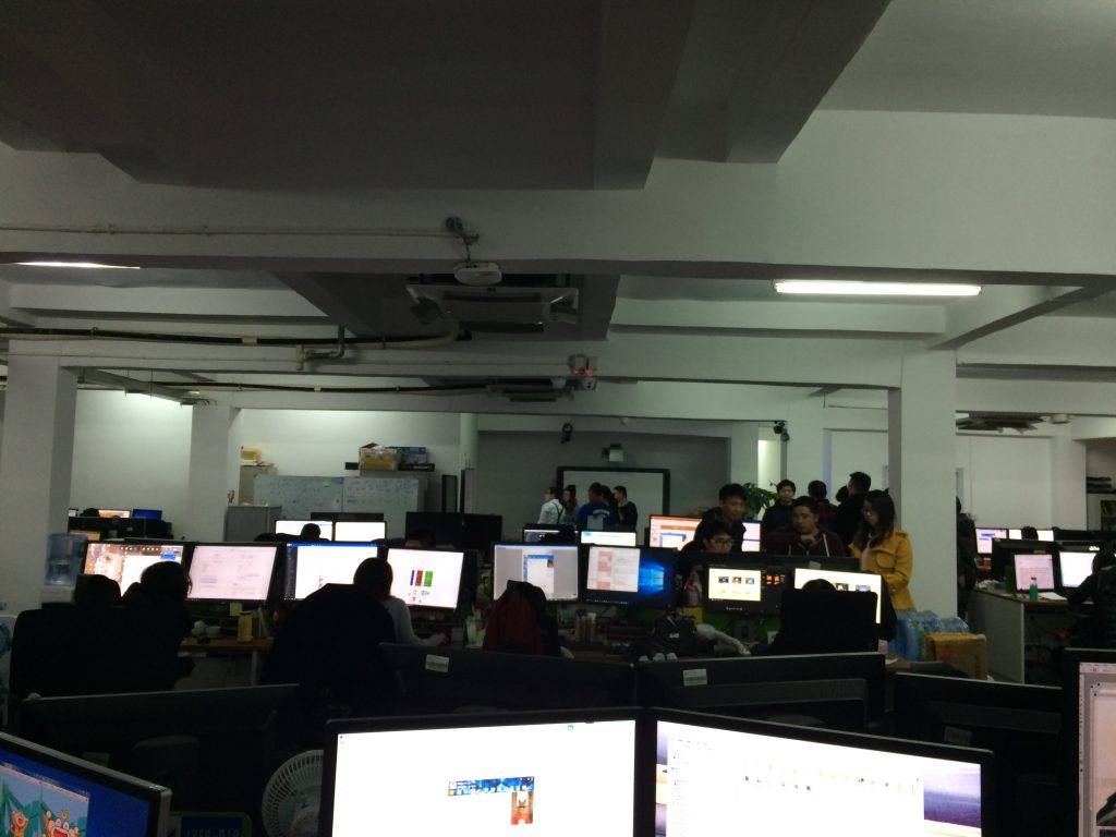
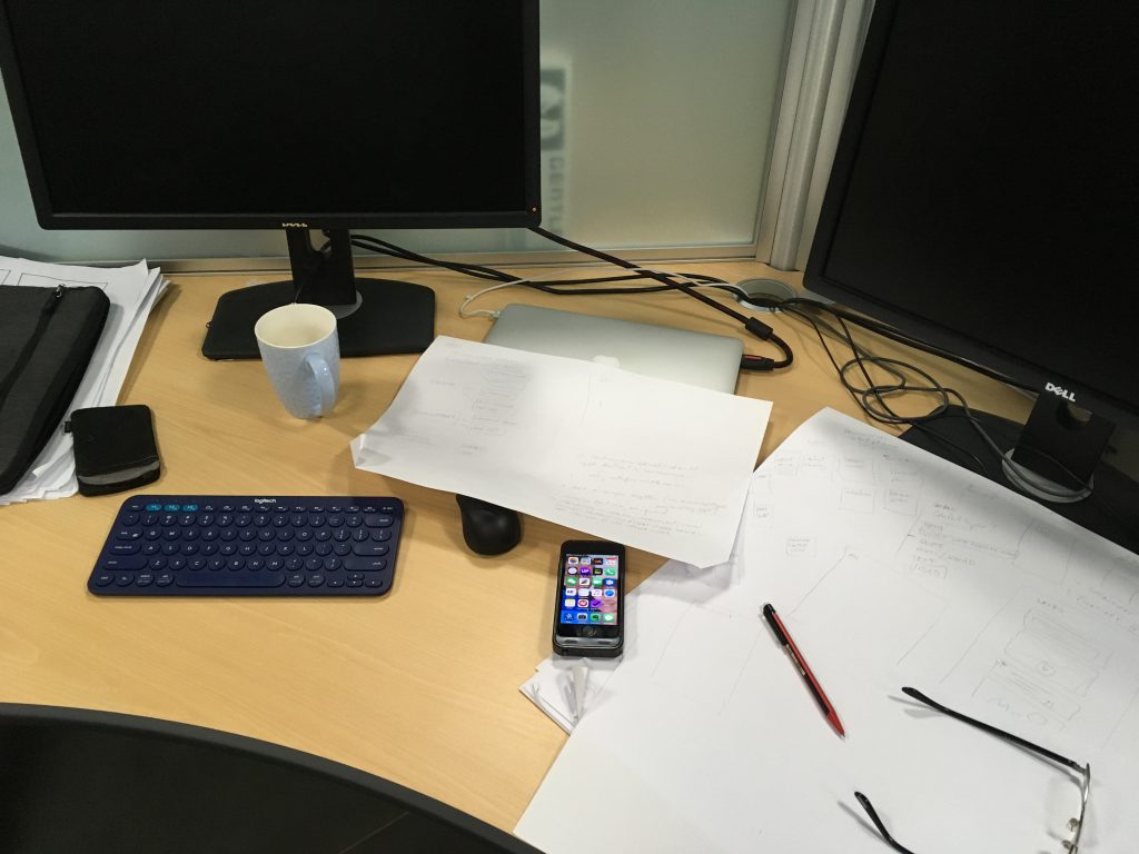
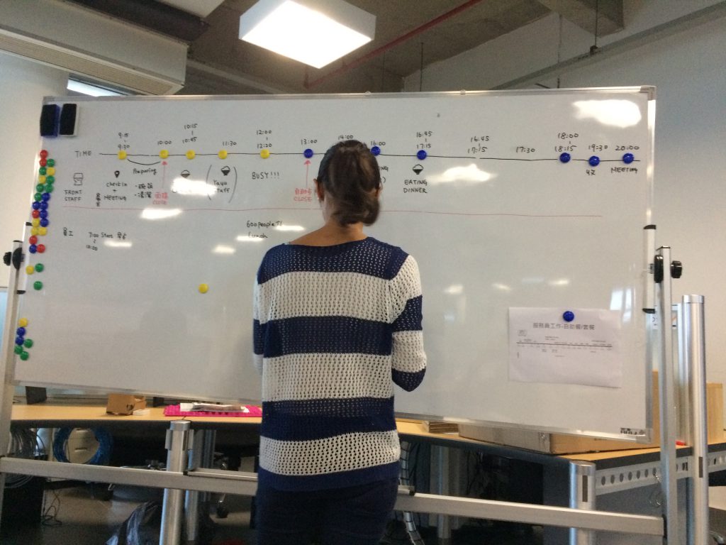
I always find it interesting to have a voyeuristic look into the work environments of others. While I wish these photos were as beautiful as many I see of design studios around the world but I hadn’t given any forethought to this series. My other photos of the of the ChangLe campus largely feature the buildings exterior and environment.

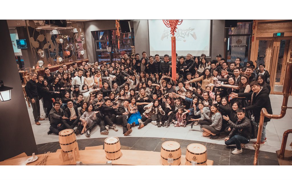
Most of the team at a dinner activity.

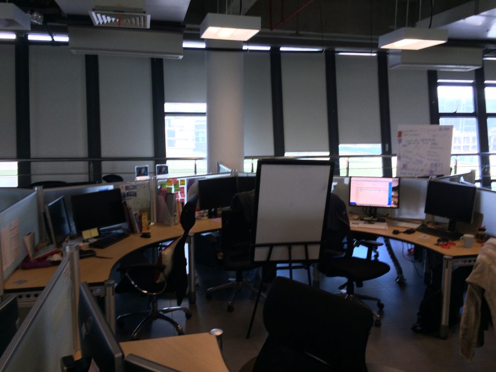
Cramped quarters in the Fuzhou office – less room for thinking and collaborating, more focused on production.

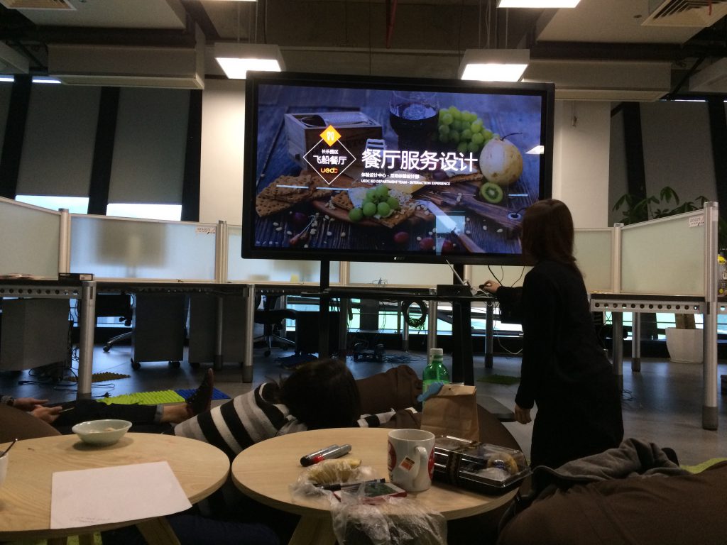
Afternoon meeting

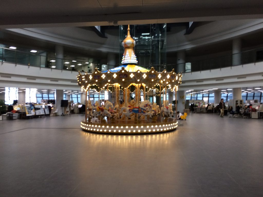
Merry Go Round near the industrial design teams workspace.

Lots of space creates possibilities for thinking and co-working.

If I have the opportunity I’ll come back and update this with new photos.


Gender neutral profile photos

For a number of years I have been questioning design decisions that lead to the standard masculine default profile photo — many designers I’ve worked with in China and Taiwan don’t yet understand the importance of gender neutral imagery. Though the original egg icon was a far better fit for their brand, in a recent redesign of the default profile photo have made an effort to address the issue and graciously shared their design thinking. It’s interesting.

Twitter’s blog post announcing the new icon.

For the new default profile photo, we decided that we wanted to use people’s existing expectations for default profile photos and how they serve as a temporary placeholder. From this process, we identified a set of traits the new default profile photo should have:

  • Generic
  • Universal
  • Serious
  • Unbranded
  • Temporary
  • Inclusive

We went through many iterations to develop the new profile photo to make sure it displayed those traits. First, we explored gray, generic images to communicate that this profile photo is intended to be temporary. We looked at figures, photos, and patterns. For the figures, we thought about combinations of very common, circular shapes – these were a good starting point because they didn’t have any notable physical attributes. Because photos are usually communicated with a landscape icon, we felt that this was also a good route to explore. We additionally considered a simple, line-based pattern to try something without a figure.

After deciding on a figure, we began our refinements. We had to determine how to bring inclusivity into our single default profile photo, given that we don’t require people to specify their gender on Twitter. We felt that the circle of the head in the figure still seemed masculine, even though it technically had no design characteristics to indicate that it was a man. So for inspiration, we looked at how women are portrayed in generic, wayfinding iconography, such as bathroom signs, and noticed that the only difference between the sexes is the shape of their clothing.

Regardless, people have come to associate the circle head with masculinity, and because of this association, we felt that it was important to explore alternate head shapes. We reviewed many variations of our figure, altering both the head and shoulders to feel more inclusive to all genders. When the shoulders were wider, the image felt overly masculine, so we decreased the width of the shoulders and adjusted the height of the figure. As a result of these iterations, we ended with a more gender-balanced figure. We chose grays because they feel temporary, generic, and universal. With that, we included a higher contrast color combination to make this image accessible for those with visual impairments. Because of its coloring, the new profile photo also gives less prominence to accounts with a default profile photo.
From Rethinking our default profile photo


Less Adjectives More Verbs

In other words, less talking more doing.

Taken from the blog of the same name, this should be my mantra for the rest of the year.