
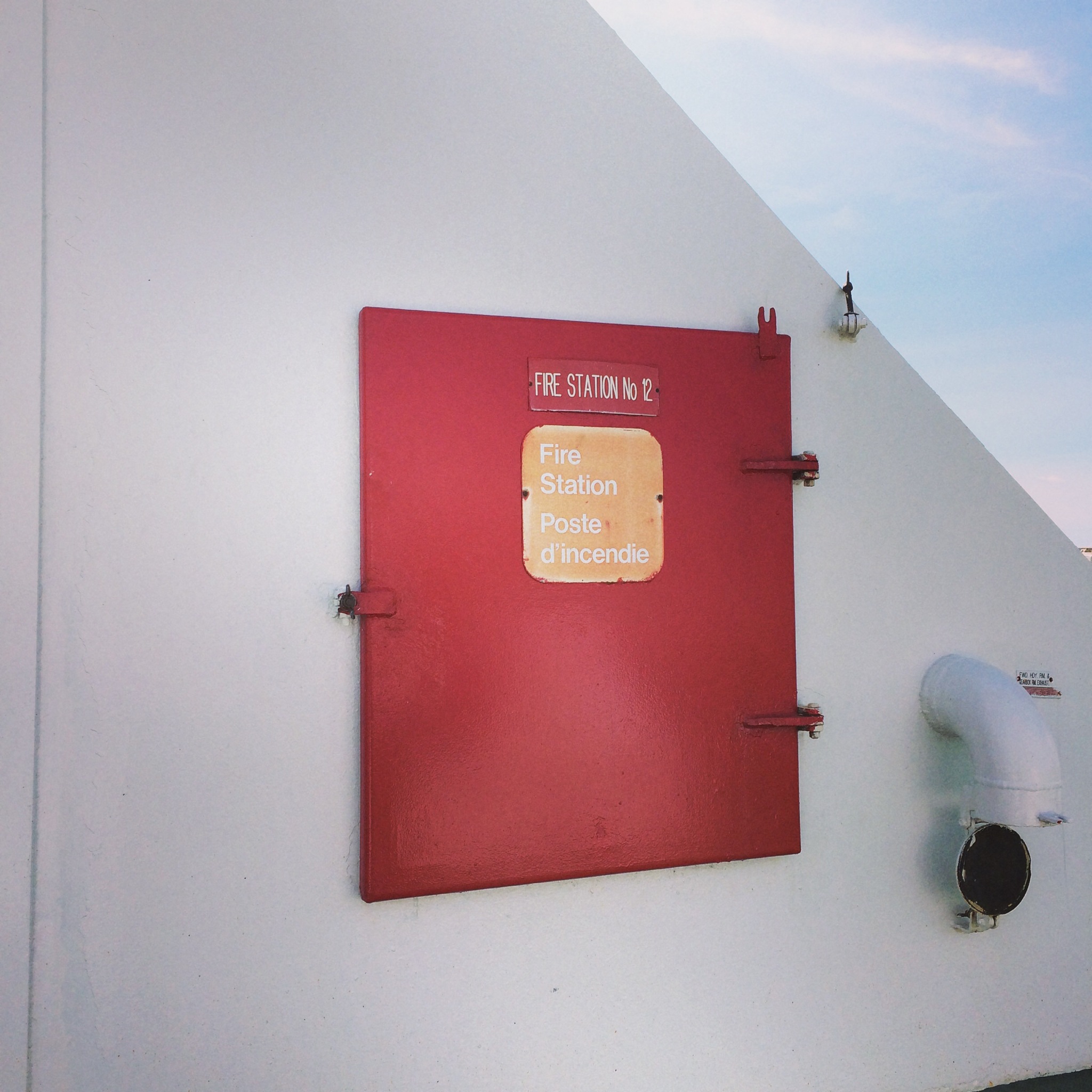
Despite the weathered type, there is no mistaking the location and meaning of the device in the photo above.
Warm colours take control, we use them for things you want to pop out and get noticed. Colours like red are especially good for this purpose. Some colours have universal meaning, but some do not. Higher contrast items stand out and catch your eye, the white background above is very effective. The same red box placed on a red brick background is less effective, a problem I often see.
This is very basic knowledge but it’s consistent application requires a discipline I don’t often encounter in my day to day environment.