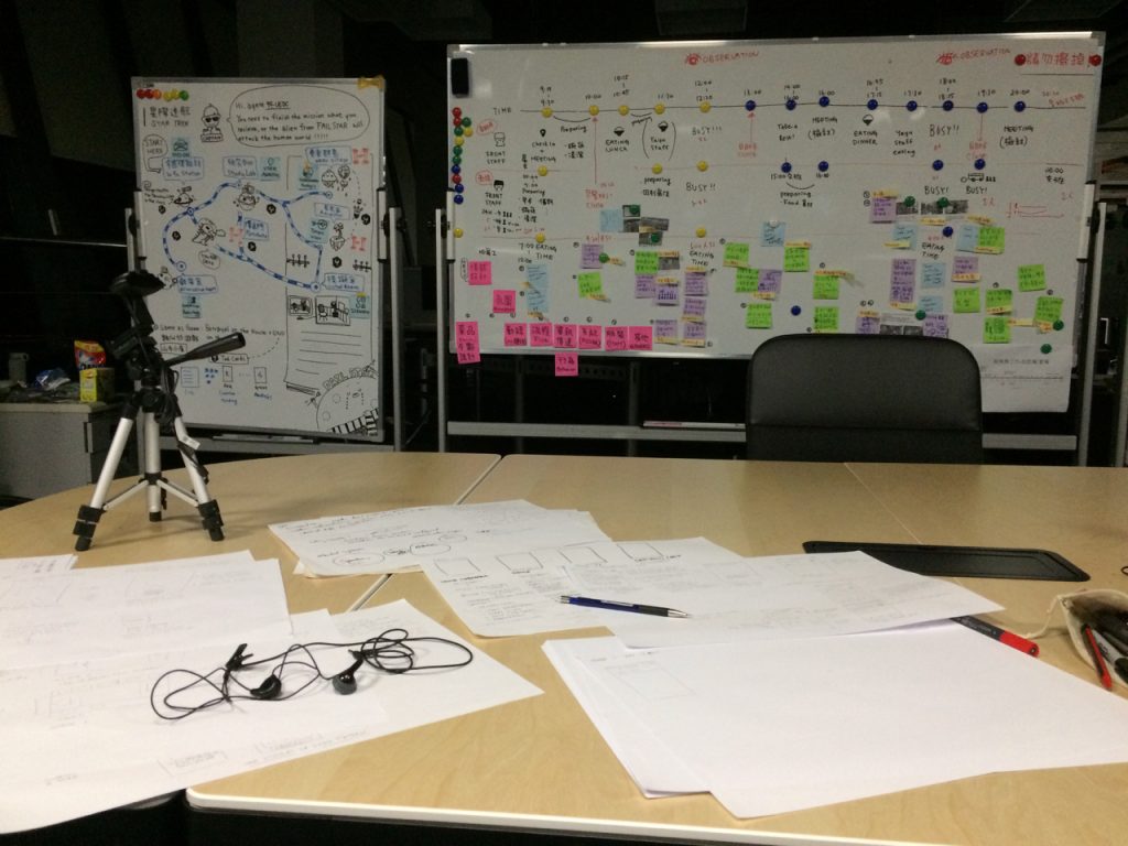
Anyone home?

I often talk about the importance of having a system and policy in place for when you publish that email address or email form on a website. You set expectations as to when you will reply and you stick to it as much as possible.

This is such a basic thing that I think many don’t even think about it any more, which is perhaps why the problems is still so persuasive.

But what about phone numbers.

Sometimes I think dusting off the Phone app and calling is a more efficient way of finding the info I need. So when a particular department at UPEI publishes the phone numbers of those who I wish to call, I expect at some point someone might answer. Except out of the the 16 listed numbers no one has answered all week.

And to make matters worse, when trying to leave a voice mail message, I get an error stating that they don’t subscribe to the service!

Does this have any real world effects? In this case, likely not. But under other circumstances, like if this was a business, I would have taken my business elsewhere long ago.

So I’m back to email. Maybe that will work. Or not.


Trading away money and freedom for convenience

Why do smart people trade away so much money and freedom for just a little convenience?

We do it all the time. We take the easy path, the simple shortcut or the long-term bad deal simply because it feels easier.

The reason? Thinking is not worth the hassle.

Cognitive load overwhelms us. Too many choices. The stakes feel too high. Every day, we make 1,000 times as many different decisions as our cavemen ancestors did. We’re exhausted from all the decisions, and more than that, from the narrative we have about making them poorly.
Seth Godin

I shop at NoFrills partially because I have found the prices on many commodities to be markedly cheaper than elsewhere. But I also shop there because of limited choice. More choice actually makes you less happy, which is counter to what many believe. I asked some people why they would shop at Super Store knowing that the prices are in some cases much much higher (same product, same parent company) and it came down to convenience, and choice. People may unknowingly make themselves less happy by these decisions.

Notre Dame high school has an interesting cognitive load links which differ from my usual reading on the topic.


The Disgust for Hush: A Universal Pattern

The fact is, lack of back-and-forth chatter makes us uncomfortable. Research by Koudenburg, Postmes, and Gordijn has shown that, in the United States, it takes only four seconds before an extended period of silence becomes uncomfortable during conversation. Four seconds! Why the disgust for hush? Long story short, humans equate silence with rejection. We have an evolution-driven desire for conversation because it makes us feel connected and accepted. So why would we want to intentionally create periods of “awkward” silence with participants in workshops or research activities?
The power of intentional silence is well-known and utilized among many professional groups: Sales people pause after their pitches for dramatic effect. Counselors practice waiting five seconds after a patient stops speaking before responding. Nurses and physicians employ intentional silence in order to demonstrate compassion and respect. And negotiators adhere to the saying: “He who speaks first, loses.”
As UX professionals, we, too, can harness the power of intentional silence. If we can just become comfortable with that brief period of unsettling silence during our user interview sessions, usability tests, and workshops, we’ll get more out of our participants. Intentional silence, used strategically, can create space, invite response, and signal interest. And it is in periods of silence where participants often offer crucial and most-poignant information.

This is a difficult lesson in so many situations; something that I had to learn not just for holding customer interviews but for any kind of conflict resolution or negotiation. I have found it to be an essential skill in Taiwan.

The Science of Silence: Intentional Silence as a Moderation Technique


Conducting User Research with an Interpreter

With Chinese and Spanish being the world’s top two spoken languages and huge growth in mobile users outside of the English-language world, there’s a good chance you could find yourself conducting research with participants across a language barrier. Rather than seeing this as an issue or trying to avoid it by seeking only research participants who speak English, plan for it and embrace the diversity of a global audience. Working with interpreters can be another tool in your toolbox for creating great user experiences. Partner with great simultaneous interpreters to help you conduct inclusive research that results in reliable, diverse input into your design process. Conducting User Research with an Interpreter

There were times when most of what I communicated was through translation, which was always slow and difficult. Instead of relying on interpreters, I found it useful to partner with others to facilitate the research that I or someone else had designed. By training people to, for example, how to conduct interviews, you not only remove a great deal of friction in your research, you also gain a new member of your team. Qualitative research is as much art as science and it takes a long time to gain real competency, but it’s something that everyone can be involved with. Another point, often times I found that my very presence in the room could create anxiety, as the participants want to please, and will feel embarrassed about their lack of English communication skills.


In the everyday world, we want to get on with the important things in life, not spend our time in deep thought attempting to open a can of food or dial a telephone number.
Donald Norman


“User” is a catchall and ultimately a mean-nothing word. It reflects
a technology-centric, rather than a people-centric, view of the Web.
To call someone a user is largely meaningless…The phrase “user-friendly” should never have had to be invented. It implies that technology is inherently hostile and that a new discipline — usability — had to be invented to make it friendlier. After all, we don’t refer to cars as “driver-friendly.” We don’t refer to bicycles as “cyclist-friendly.”
We don’t refer to chairs as “bum-friendly.”
Gerry McGovern, gerrymcgovern.com


NN/G: Children’s UX

What would we do without Normon Neilson Group’s broad strokes.

New research with users aged 3–12 shows that children have gained substantial proficiency in using websites and apps since our last studies, though many designs are still not optimized for younger users. Designing for children requires distinct usability approaches, including targeting content narrowly for children of different ages.

As anecdotal evidence might dictate, kids with ever increasing times spent with screen based devices are becoming more proficient in their use and more particular in their preferred interaction models:

Little kids, big expectations. Because children spend more time with devices than 8 years ago, they have more opportunities to get a sense of how things can and should work online. Children expected to be able to tap on and interact with characters and pictures in interfaces, both on touchscreens and desktop displays. (Speaking of touchscreens, several kids tried tapping on nontouchscreen laptop displays and were disappointed when they got no response). Kids expected some sites to play sound or have animation. One pair of 8-year-old girls spent several minutes trying to get a page to play sound and animate, so they could enjoy a game more.

Despite these higher expectations around interactivity, children did not have the same degree of disappointment that adults did when an app or site didn’t work quite as they expected. Yes, children did get frustrated when designs weren’t as fast as they liked, but they also were used to a lot of games simply not working, so they shrugged it off as a bug or something beyond their control. Still, given the option, they’d choose to browse or play something else if a site wasn’t working well.

A willingness to work around difficulties. There’s a myth that children “just know” how to fix a problem or get a website or app to work correctly. That’s not generally true (except for a few especially tech-savvy users). However, as kids get experienced with devices, they do become comfortable trying a different approach before giving up entirely. They would refresh the page, close and reopen the browser or app, or use the Back button and try again. Though they weren’t skilled troubleshooters (they weren’t good at problem solving or understanding the root of the issue, and they struggled to interpret error messages), they were very willing to try a few quick solutions. This willingness to experiment is something that users who have grown up with digital devices are more likely to have than users who have entered the digital world later in life. If after a few tries kids still couldn’t get something to work, they’d just close the tab, the browser, or tap the device’s Home button and pick something else do to.

It’s a great report full of useful (and reusable) bits of data.

Children’s UX: Usability Issues in Designing for Young People


Why you don’t need a representative sample in your user research

Engaging a representative sample of participants in user research sounds like a good idea but it is flawed. It requires lots of participants, does not work in an agile development environment, stifles innovation and reduces your chances of finding problems in small sample usability tests. When combined with iterative design, theoretical sampling (where theory and data collection move hand in hand) provides a more practical alternative.
Why you don’t need a representative sample in your user research

People coming from a marketing or advertising background often have trouble believing the effectiveness of small sample sizes.


Why would we bother to talk to our users?

People who make a product think and talk about it fundamentally differently than people who don’t. While both groups may use the same product, their context, understanding, language, expectations, and so on, is completely different. From a user’s point of view, a Big Mac eaten in Moscow is hardly the same product as a Big Mac eaten in San Jose, CA. And neither one is very much like a Big Mac eaten at McDonald’s Hamburger University in Oak Grove, IL. A strong product vision is important, but understanding what that vision means when it leaves your bubble is make-or-break stuff. Interviewing Users: How to Uncover Compelling Insights by Steve Portigal


Web View Controller or Not

Something that I was thinking about yesterday, was whether to have links to contact, support, privacy policy and some such, open within a web view in the app. or hand off to safari. It’s simple to implement either, and I’m not concerned with people leaving the app, so it’s only a matter of what is best for the apps users.

The complication is that the app is designed for children, while the customers are parents. How do parents feel about opening a browser vs. an embedded view of web content? I can’t find any best practices.

These elements are often buried deep within the information structure of many apps and you often have to work hard to find these standard contact, support, privacy policy and “marketing” uri. I suspect for many this is as much an afterthought as you see on the web. But while I suspect that very few will bother with the feature, I do want to support those who feel the need to reach out with their complaints, concerns, and feedback.

Some apps I have seen add some kind of heavy handed “gotcha” type test to filter out younger users, but the experience is sub-optimal and kids are generally smart enough to subvert most of these types of controls anyway. What I decided to do, at least until I can gain some feedback from future tests, is to simply hand off to safari with the belief that if access to the web is a concern to parents that they will have set up controls on the phone, or at least monitor their children’s usage.


Improving Onboarding with Employee Experience Journey Mapping

I so wanted to map out the onboarding process for the last company I joined – most couldn’t believe just how bad it was. Unfortunately this idea like so many never saw the light of day, due in part to the reluctance of HR to hear any ideas that might lead to constructive change.

We present a creative method for applying the UX technique of journey mapping to improve the onboarding experience of new employees in any organization. Journey mapping is a well-known design research tool used to gain insight into how a user experiences a service, process, or product, with the goal of making informed improvements to deliver a better experience for future users. We argue that journey mapping can also be used to improve the internal process of onboarding new employees and improve the experience for future new hires, which is important because positive onboarding experiences are linked to increased productivity and greater employee retention. We share how other organizations can use journey mapping to improve the onboarding process utilizing our employee experience journey mapping project toolkit designed to help guide similar projects, complete with shareable templates. In addition, we share the methods used at our library, as well as our findings, recommendations, and lessons learned.

Improving Onboarding with Employee Experience Journey Mapping: A Fresh Take on a Traditional UX Technique


Wouldn’t it be better if self-checkout just died?

I’m pretty certain that self-checkouts at this Walmart in Fuzhou would have been absolute chaos. But on our workplace campus they were the norm and surprisingly well designed.

Self-checkouts have been around a while. Companies have been working on them since 1984, and they’ve been in stores around the US for nearly two decades. And as any interaction with the one at Walmart in Charlottetown will attest, the user experience still sucks.

It’s not as if “scanning items at a checkout” is an especially daunting task but it turns out that making an automated system that’s 95% as good as a human is relatively easy and one that’s 100% as good as a human is very hard.

“Wouldn’t the shopper be better served, customer service improved, if those (self check-outs) weren’t there?” he asks. I’m not arguing. “Why do I want to scan my own groceries?” he asks. I have no idea! “Why do I want to bag my own groceries?” he asks. An equally reasonable question with no reasonable answer. The simple solution, he points out, would be to hire enough cashiers to serve the number of customers that typically shop at the store. I agree, and this seems very obvious.

Wouldn’t it be better if self-checkout just died?


User test session surprises

I am gearing up for a series of user interviews/test sessions slated tentatively for the end of this month. It’s been awhile since I’ve done one, over a year, and while it exists in muscle memory, the actual design of the sessions requires some review. Especially since the sessions will be facilitated by someone other than myself, someone with no background in running such sessions. Indi Young’s book Mental Models has a couple good short chapters on interviewing users which I often refer back to time and time again.

As I was sharing my plan prior to a stand-up meeting yesterday, I recounted how illustrative these sessions can be. You can craft what you consider to be the most elegant interface you have ever created, perfectly suited to the target customer, only to have a participant tell you bluntly that it sucks. Of course they don’t come out and say so, such cut and dry responses are not so useful, but the sessions are such a great way to learn what works and what doesn’t. And they keep you focused on what design is really about, creating “things” for someone other than yourself.

The above video is a short excerpt from one such session in many years ago. As I related yesterday, this test came as a total surprise. At the time I was creating a number of hardware based prototypes – embedding pressure sensors into everyday objects, in this case pillows, in order to control software. I created a version for Adults which use a complex sensor to control the creation of music, and a basic on/off sensor fashioned from a keyboard logic board, to control a children’s musical game. The game was extremely simple – the kids just had to reorder the elements of a song by sitting on pillows. It was a musical memory game but played on a larger scale. The software ran on an iMac but I envisioned it running on a console or PC.

My expectation was that the kids would be bored and that my concept was flawed. But within the scope of this test, the opposite proved to be true (later it was abandoned as my intuition proved accurate).

This is what I like most about user research, discovering these insights and surprises when watching people use a product. It’s a great way to learn about people, and of course, whether its a formal or informal session, an essential part of creating a usable product.


To change the mindset of your stakeholders from being naysayers to being advocates for user research, you must help them understand how research can add value to their product and that learnings from user research are an indispensable asset to a product team.

If I had this skill when I was freelancing full-time, I might not have watched as that period of my career floundered out of my own boredom. Without the clients to support UX methods of some sort, the problems and solutions all started to seem the same. But it was a hard sell then (and my business development skills were exceptionally poor) – anything that wasn’t writing code or creating concrete deliverables was deemed un-billable.

UX Research Is Essential to Product Success


Common UX problems to challenge and inspire designers

There are a few design problems floating around the internet, but nothing very extensive. I thought it might be useful if I collected some together and put them in one big list.

The examples here come from all kinds of places including personal experience, but I take no credit for any of them. I’ve included links when I know I saw it someplace else. I’m pretty sure a few came from my own imagination, but somebody else probably had the same idea first. It’s just the way ideas work. Still, if you want to be credited with one of these, let me know and I’ll happily link to the original.

You don’t have to look far to find some problems to fix. You could spend hours and hours finding problems with the Apple TV alone. Just walking down the street you can find issues due to poor design. ATMs, elevators, language selectors (“every” service in Canada adds an extra step due to language), parking meters, parking lots (they have really upped their game here in Taiwan with sensors and license plate recognition), and public navigation for the visually impaired.

But this list is a great start and features some problems that have a little more sex appeal than optimizing elevator keypads.

I plan to go through the list, creating sketches, storyboards, and prototypes. When I was in China I did a similar exercise, I had to come up with 5 ideas a day. At that time my focus was entirely on solving existing problems and thinking of something new helped exercise my mind. It should be fun.

100 example UX problems


Great piece.

The menu bar has been, and in my opinion remains, the best mechanism for providing familiarity, discoverability, and progressive disclosure in user interfaces on any platform. Even beyond the Mac, anyone who has clicked on a File menu in one platform has a pretty good shot at guessing where a Save command might be when provided a File menu somewhere else. Likewise and also regardless of operating system, someone presented with an entirely new application can safely open and explore menus to try and locate features they might need. Never pivoted data before, but need to for the first time? Hey look, there’s a menu in the bar called Data! Finally, let’s say that same seemingly one-time operation becomes a regular course of action that is needed multiple times a day. The best menu bars provide an equivalent keyboard shortcut right next to the command so, for example, anyone can discover how to save using command – s without having to be told.

So then why are menu bars fading out of more modern UX conventions?
The Menu Bar


The forgotten UX of the contact feature

Hard to believe this is still an issue.

When I started in design many years ago, particularly when I started working with small and medium sized corporate clients in Taiwan, one of the most common features that we would work on to improve their corporate websites user experience was the addition of easily findable contact information, and all the back-end systems required to make it effective. There was no point in including a phone number for support if no one was there to pick up the phone. At that time this was one of the primary tasks that users would visit a website to perform. Of course, it’s as common as air today, and yet this most basic element of a good user experience, has been the most frustrating for me in my interactions with a number of companies of late.

In Taiwan, I think it must be generally accepted that email is broken. With some exceptions, you don’t send an email to a government department and expect a reply, nor do you email a company and expect a timely response. I once sent an email to Garmin in Taiwan about one of their products and got a short 2 sentence reply 8 months later. In the interim I bought a competitors product. Facebook or Line is the way you interact here and I have had varying levels of success with that as well.

When I was last in Canada, I sent out a number of email to various local government departments. Reply times were generally 2 weeks – its best to use the telephone.

This past summer I had an agreement with the TD Bank in Charlottetown that we would communicate via email so that I could do some investing and take care of my mothers estate. The first couple of email replies were within a couple weeks, then no replies for months, then no replies at all. I doubt I will do any further business with this bank, and am considering switching completely to another institution.

Correspondence with a local Charlottetown insurance agent went unanswered, and the requested actions never took. That coupled with a misrepresentation of the policy itself means that they will lose all my current and future business once the current policy expires.

TDBank isn’t the only bank in Charlottetown with a poor communication experience. I sent an email, via their internal systems, one of the required methods off contact, to the Royal bank in Charlottetown looking to set-up an appointment to discuss a loan. It’s been a week and no reply. I guess they don’t need the business.

Finally, in looking for a place to live in Prince Edward Island, I’ve sent email to a number of rental companies. Despite a big bold contact box on all their websites, not one has replied. The rental market in PEI is a landlords market, so perhaps they don’t need to worry about drumming up business or damaging their reputation.

These are just a few examples of the may experiences I’ve had.

What companies don’t seem to realize is that by including a simple means of contact on their website they are setting the expectation that they actually want, and or are able, to communicate with their customers. By not paying attention to this most basic user task their customers experience with their company is most certainly poor, thereby losing opportunities, harming your brand, and doing a disservice to your organization. And for smaller organizations it’s just plain rude.

Before you absentmindedly add that contact information module to your website, do yourself and your company a favor and ensure that you truly are committed to communicating with your customers. You might even try stating when they might expect a reply, something even I do on this weblog. Set your customers expectations with a statement stating when they could expect a reply, and perhaps a follow-up email acknowledging receipt of said email with further confirmation of as to when you will get back to them. It’s not really that difficult.


Remove business risk through testing

The old world of business was one of trial and error; sometimes ideas worked out and sometimes they went belly up. The only way people learned in this context was through painful failure.But today there are other options. Now business people can remove the risk from their ideas, while reducing the costs incurred in the event of failure.They do this by verifying products through user testing. In other words, rather than assuming you have a great idea that will solve your customer’s problems, why not just put it into action and see what happens?People often have great ideas that don’t correspond to the desires of the market, and by testing these ideas on a selection of users and gathering feedback in the process, one can fine tune them so they fit market demand. From there, a revised product can be rolled out, its success can be measured and further feedback can be incorporated.

UX Strategy: How to Devise Innovative Digital Products that People Want. Source


“A good user experience isn’t necessarily that far removed from a poor user experience. It can be small, subtle differences that can have a huge impact.”
Nathanael Boehm


“Nothing ever becomes real till it is experienced. Even a proverb is no proverb to you till your life has illustrated it.”
John Keats.


Book section ‘fixed’

The last few times I casually visited my page of books, browsing the pages in your own website can only be the result of procrastination, I noticed how the display was more askew than normal. Quick looks at source gave no answers and I silently cursed myself for letting my web development skills fall into a state of uselessness. As it turns out, it had nothing to do with my quirky source but everything to do with a conflict with Pinterest’s Safari extension. Thanks Pinterest, and goodbye extension.

My books section is a curated list of books I have relied upon, read, referenced, used as a doorstop, in an effort to give myself a decent education into the field of user experience and design.


Long deliverables

I was about to launch into my normal rant about how 30-page research presentations and enormous PowerPoint decks full of qualitative data are horrible wastes of time and how they must be avoided at all costs, but I’m tired of giving that speech. Instead, I sat down with the person and started asking questions. What I came up with was this framework.

At the start of any project, or when entering a new project, I always spend a considerable amount of time on some kind of research. Whether that is combing the internet for related research (mining data from documents), reading blogs, articles, case studies, becoming familiar with the full range of competitors products or more formal methods like interviewing users. I attempt as quickly as possible to become as much of an expert as I can be within this new realm — this way I feel I can give a greater contribution and perhaps use this data to inform design. But most companies I have worked with don’t have a robust system for sharing this knowledge and it seems selfish to keep it all to myself (and rather selfishly I also want to give teammates some indication that I did this work in the first place), so I end up writing long briefs with all the accumulated knowledge. I’m received some push back to this habit, as many people don’t have the time to read pages of briefs.

I feel that combining illustration with hyper-summaries would help but my poor illustration ability would only make the results less clear. I’m still working on an ideal solution that works for me and the people I work with.

Laura Klein has some ideas on how to organize your ideas on the topic in her article Creating effective UX research deliverables.


People need to feel in control

254616645_de5bc13084_b

From Close door buttons on elevators are designed to be utterly useless, which reveals how elevator close door buttons and pedestrian crosswalk buttons don’t actually map to any function. Pushing buttons, even when they don’t really do anything, makes us feel better. Psychologists believe the perception of control is beneficial in helping to reduce stress.

Dr. Albert Bandura, an influential social psychologist, coined the term “self-efficacy” to describe people’s internal beliefs about their ability to have an impact on events that affect their lives. Your self-efficacy is your belief in your own effectiveness as a person, both generally in terms of managing your life, and specifically with regard to competently dealing with individual tasks. In the context of stress, self-efficacy describes your beliefs about your ability to handle stressful situations. A large amount of research has demonstrated quite convincingly that possessing high levels of self-efficacy acts to decrease people’s potential for experiencing negative stress feelings by increasing their sense of being in control of the situations they encounter. The perception of being in control (rather than the reality of being in or out of control) is an important buffer of negative stress. When people feel that they are not in control, they start feeling stressed, even if they actually are in control and simply don’t know it. Another reason that people feel stressed is when they feel out of control because they do not possess the appropriate coping skills, resources, etc. to adequately cope with the situation.

When a given demand (e.g., passing an exam, winning a race) is perceived as something you can handle because you expect you will do well based on preparation or past experience (e.g., because you have studied for the exam or trained for the race), you are likely to perceive the demand as a challenge and as an exhilarating experience. After the event is over, you may even have a resulting boost in self-esteem because you worked hard to meet the demand and succeeded. If, however, the demand seems beyond your abilities, you will likely experience distress. Across time, feeling unable to respond effectively to stressful situations can further decrease your sense of self-efficacy, making you even more prone to experience distress in the future.
Self-Efficacy And The Perception Of Control In Stress Reduction

Think of this the next time you are designing a UI or task flow, especially when the UI or task may involve a certain amount of stress in your users (I don’t mean give them useless buttons to push). Giving users the feeling of control, proper feedback, and a feeling of accomplishment will increase the positive feelings they have when using the product.


Spark Synchronisation Dialog

Shouldn't that be Synchronising?

Shouldn’t that be Synchronising?

This simple dialog from the iOS email app. Spark illustrates how you need to consider different possibilities when creating copy for dialogs. In this dialog, “Please wait a minute” might seem like a great choice, it’s polite and gives what could be an accurate estimation of the task completion. The graphic also gives the user a sense of progress. Unfortunately in this instance there was an error which prevented the process from being completed, turning an estimated 1 minute task into 5 or more. It’s hard to accommodate outliers but it’s how you handle these instances that make a greater impact.

In the absence of accurate data (this I am sure was supposed to be a very short process so they likely decided not to include a progress bar) it’s important to properly set user expectations, well it’s always important to do so. Copy plays a big part in this.


Icons need text labels

I’ve spent a great deal of time recently staring at ambiguous icons trying to guess their meaning and offer suggestions, it’s a fascinating study and mind numbing at the same time.

When designing icons for interfaces it’s important to note that a user’s understanding of an icon is based on previous experience. This came up recently when evaluating an interface’s usage of the checkmark symbol as a signifier of a change of state (in this instance selecting a photo). In my experience this has always signified completion or success when working through a task or a process, but it seems Apple and Google both are using this in entirely different contexts.

In her article “Icon Usability” Aurora Bedford argues that “due to the absence of a standard usage for most icons, text labels are necessary to communicate the meaning and reduce ambiguity”. I’m not sure this is possible in every instance but it’s a valid argument.

Icon labels should be visible at all times, without any interaction from the user. For navigation icons, labels are particularly critical. Don’t rely on hover to reveal text labels: not only does it increase the interaction cost, but it also fails to translate well on touch devices.

Via: Icon Usability


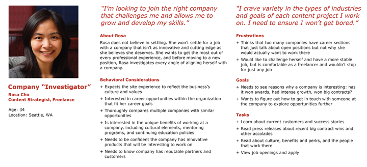
Persona definition

persona

From Aurora Bedford:

The field of user experience centers on the idea that we must design products around people, rather than teaching people how to use products: user-centered design (UCD), not technology-centered design. In order to do so, we must understand people—their behaviors, attitudes, needs, and goals. […]

A persona is a fictional, yet realistic, description of a typical or target user of the product. A persona is an archetype instead of an actual living human, but personas should be described as if they were real people.

The description should be thorough, including details about the persona’s needs, concerns, and goals, as well as background information such as age, gender, behaviors, and occupation. This focus on a singular individual—or a small set of individuals, if using multiple personas—fosters empathy for the specific users we are designing for, and helps us break away from the attempt to design for everyone. A persona doesn’t need to document every aspect of the imaginary individual’s life, but rather should focus on those characteristics that impact what is being designed. It is likely that a business will have several personas to cover the various aspects of their organization, with one or two of them identified as the main targets for each product or service, feature set, or content area of a website.

Common pieces of information to include are:

  • Name, age, gender, and a photo
  • Tag line describing what they do in “real life”; avoid getting too witty, as doing so may taint the persona as being too fun and not a useful tool
  • Experience level in the area of your product or service
  • Context for how they would interact with your product: Through choice or required by their job? How often would they use it? Do they typically use a desktop computer to access it, or their phone or other device?
  • Goals and concerns when they perform relevant tasks: speed, accuracy, thoroughness, or any other needs that may factor into their usage
  • Quotes to sum up the persona’s attitude

Via Personas Make Users Memorable for Product Team Members